Styles & Templates
This project can be found in /Styles. In this example, the following concepts are applied:
- Styles
- Templates
- Resource Dictionaries
After building a few WPF applications, I had the curosity... How can I make things look different?
I knew that controls have properties (like Background, Font Size, etc..) and by changing them, you can get a new visual style. But doing this for every control
in their XAML seemed to be a very hard job, and very error-prone: I was looking for something similar to what CSS does for HTML.
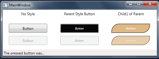
Img 1. Screenshot of the application.
WPF Styles
It didn't take long to realize, that the WPF Styles were what I was looking for. There are 2 different approaches to styles:You can declare them in the <Window.Resources> ..... </Window.Resources> , but this approach isn't very convenient, because if you want to have a consistent look across your whole application, you will have copy & paste the same code several times !
Another way to do this, is by using a Resource Dictionary. Using this method, we can style all our application, without having any duplicated code. To create a Dictionary, we can right-click our project -> add -> new item, and select Resource Dictionary. Before we can use this in our application, we have to reference it from our App.xaml.
In App.xaml:
<Application.Resources>
	<ResourceDictionary Source="myDiccionary.xaml"/>
</Application.Resources>
Now that we have it referenced, we can acces anything declared in the Dictionary from our application.
Defining Types
In this Dictionary, we can declare Animations, Brushes as well as Styles. Lets see a few examples of these.
Brush
Here is a declaration of a very simple brush. It has a Key (thats the name by which we can call this brush from our application), a StartPoint and an EndPoint. It can contain as many GradientStops as we wish, which determine the color we obtain from this Brush.<LinearGradientBrush x:Key="myBrush" StartPoint="0,0" EndPoint="1,1">
<GradientStop Offset="0" Color="#FF333344" />
<GradientStop Offset="1" Color="#FF666677" />
</LinearGradientBrush>
Animation
The animations are pretty easy to implement also. We have a Key and a type of animation (in this case, DoubleAnimation, meaning that this returns a double value). We also need to set at what time the animation will start (in this case, 0s after the event) and for how long. Which property of which target is gonna listen to the double changing also needs to be specified.We will see how to call this animation from a trigger later on. From now on, the difinition is enough.
<Storyboard x:Key="GlowIn">
    <DoubleAnimation x:Name="AnimGlow" BeginTime="00:00:00"
	Storyboard.TargetName="targetName" Duration="00:00:00.250"
	From="0" To="1" Storyboard.TargetProperty="Opacity">
    </DoubleAnimation>
</Storyboard>